
Overview
The Olive app is a lifestyle solution that provides users with insights that one can use to better their health and wellbeing. This app provides consumers with personalized information, programs and resources that improves their health. Users can read articles, watch health-related videos, book doctor appointments and more.
Problem Statement:
Users need a way to record and access their medical information and appointments, find events as well as resources about healthy lifestyles all in one application to avoid using multiple apps as this is causing stress and confusion and makes accessing information that much more difficult.
TYPE
Health & Wellbeing App Concept
SKILLS APPLIED
UI & UX, Research, Logo Design
SOFTWARE
Adobe XD, Illustrator
ROLE
UX/UI Designer and Researcher, Interaction, Visual Design, Prototyping & Testing
Design Process
The process follows the design thinking process which focuses on the human-centered and iterative process to solve and tackle the problem.

Understand
Competitive Analysis
I explored unseen opportunities in the market, strengths, weakness and threats. I discovered there were many similar applications, but none that encompassed it all in terms of health and wellbeing. I chose this as my starting point.
Results: the competitive analysis identified the opportunity to meet other user needs such as a health app that allowed users to not only track, but to be able to track, record, find pertinent health information and book appointments with doctors.


observe
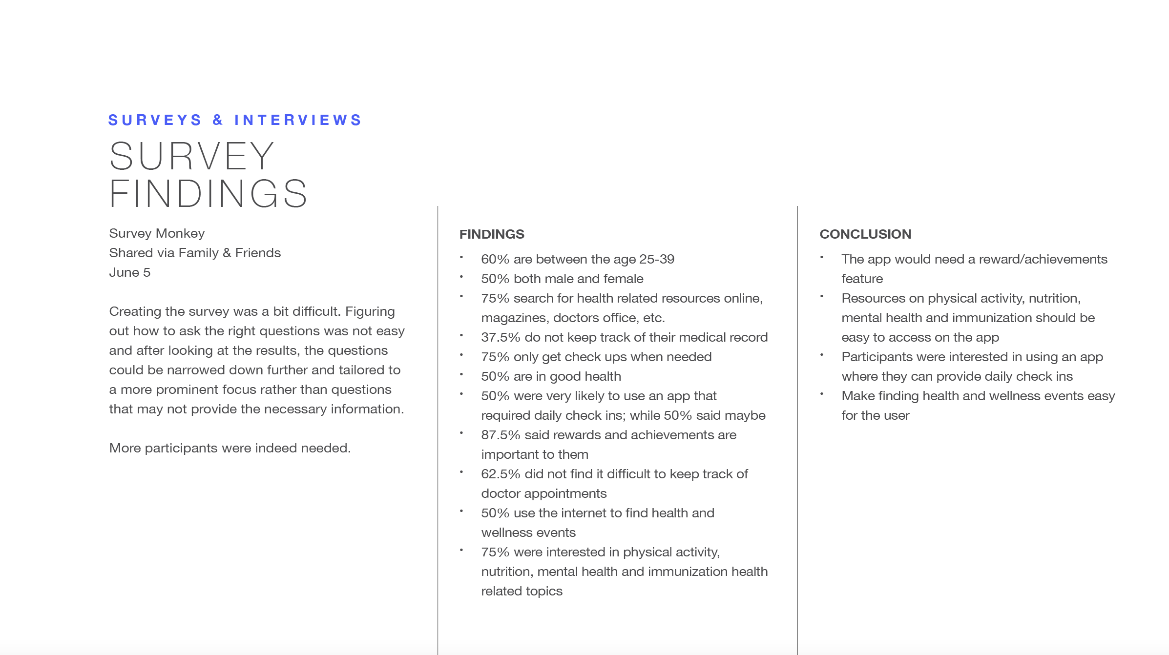
Surveys & Interviews
To receive initial data on potential users’ attitudes, behavior and emotions, I conducted a survey with 10 participants and interviews with 4 participants. These informed the user personas by understanding needs, pain-points, goals, wanted features and any additional elements pointed out by the participants. The overall goal was to understand how users tracked their health.
Survey Results:
50% use an app to keep track of health
0% go to see a doctor due to lack of reminders
Majority are looking for a one-stop show for health needs
90% want reward earnings
50% want goal setting
Majority want accuracy and privacy


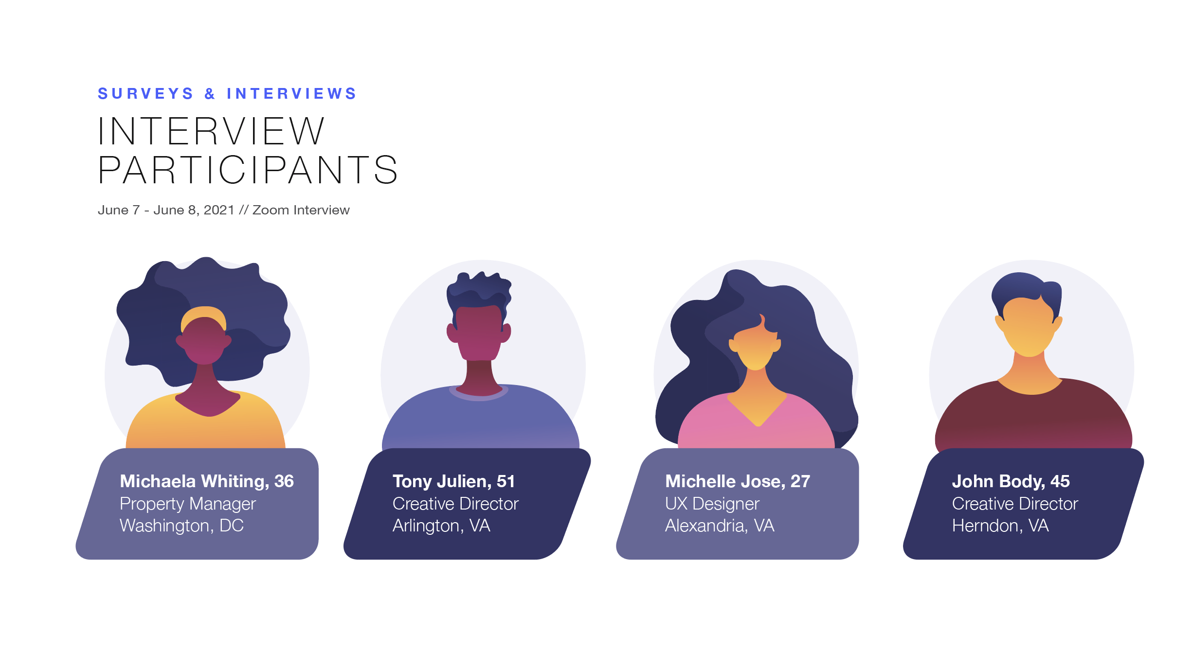

Interview Results:
Once interviews concluded, a final list of insights were collected and organized in the form of an affinity map. I focused on behaviors/attitudes, needs/goals, pain points, quotes and facts for each participant. I then sorted participant themes into clusters and insights.
Insights:
Participants were all focused on health & wellness
All participants were looking for a more information in the form of content
75% of participants use an app that helps them record their medical record
50% of participants find it difficult to book a doctor’s appointment due to lack of reminders
All participants find it difficult to juggle life and health
0% of participants do not attend health-related events and/or know where to look for them
All participants rely on Google when look for health-related content of finding a doctor


ideate
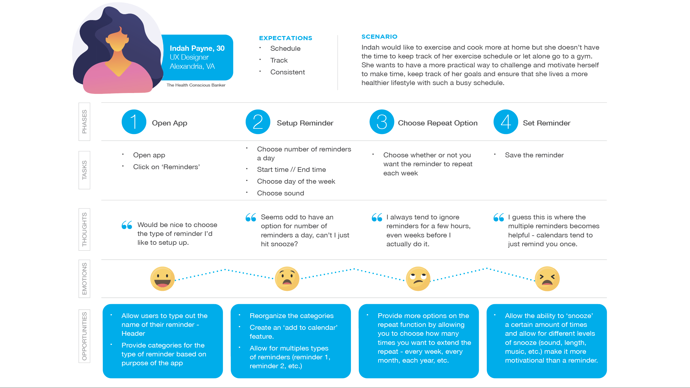
Personas
The following images illustrate the creation of two user personas, journey maps and user flows. I created journey maps for each of my personas based on their individual goals and actions as well as the outcomes from the initial user interviews, survey results and competitor analysis.
I used the desired thoughts and mental states to come up with design opportunities. This gave me inspiration for the types of functions and features I might include in the app during the ideation phase.


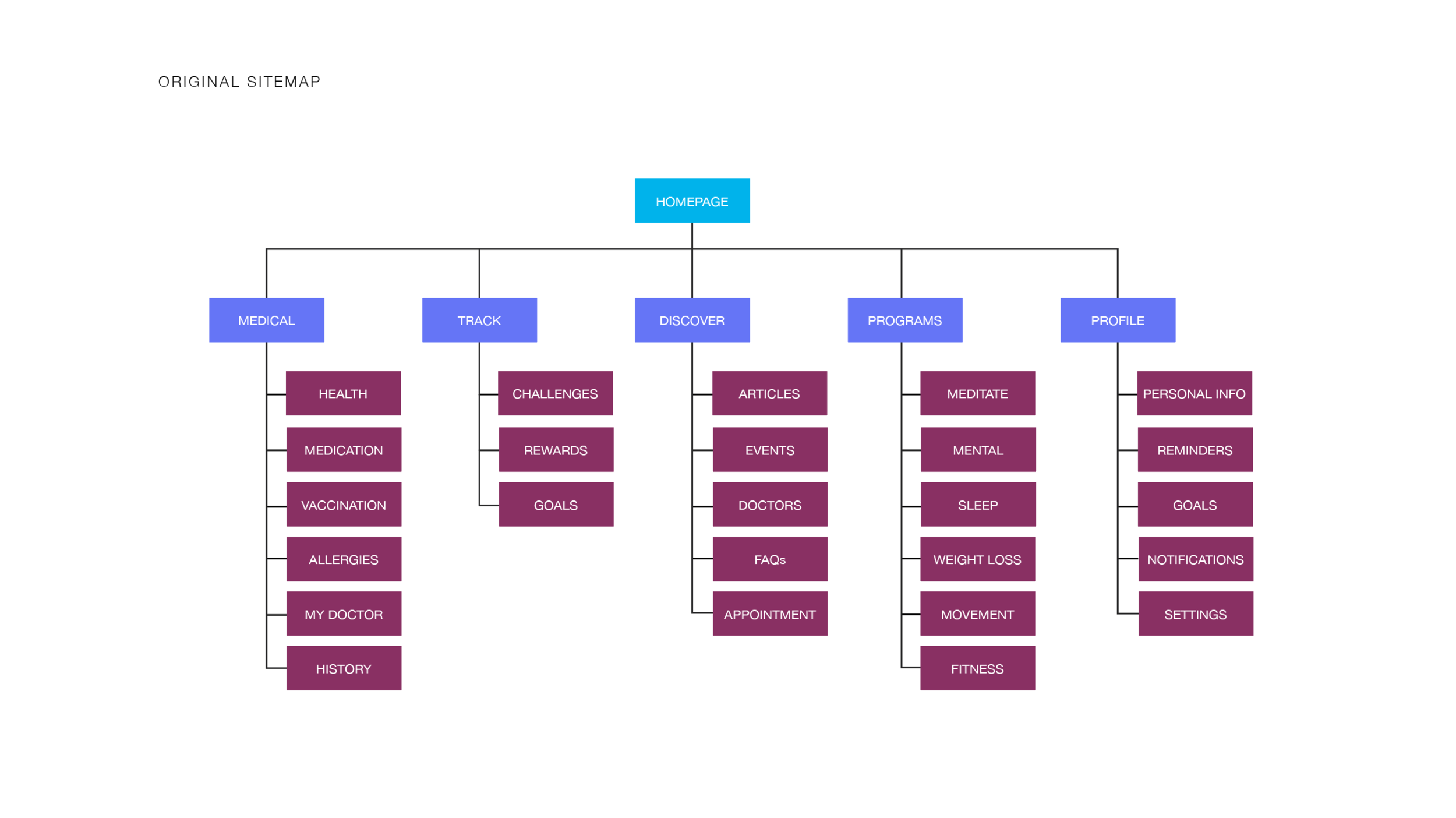
Card Sorting & Site Map
The next phase was to put together the app’s architecture in such a way that allowed for seamless navigation. This consisted of creating an original site map then using a card sorting technique to iterate and further improve the information architecture.
Groups ranged from 3-5
Pretty clear and obvious combinations
Cards focused on elements that would be showcased within the app
Goal was to have participants create categories for the cards to help determine the sections of the app.

Prototype
Once the research phase was completed it was time to begin putting ideas on paper. I began by sketching simple wireframes to understand the layout and overall composition. This helped me determine what elements to include and where to place them.


TESTING
After completing a high-fidelity prototype, the next step was to conduct a usability test with users in order to uncover any potential errors and to ensure all elements of the app worked seamlessly.
Goals and Objectives: The primary goal was to find errors in the app’s current design, fix these by learning from the users. During each interview it was crucial to observe, listen and watch their emotional state regarding their health needs and zoom in on their emotional condition.
Methodology:
Tools and Methods:
Recording: Zoom/iPhone
Devices: Computer/Mobile
Duration: 15-30 Minutes
Tasks:
Register
Find health-related content
Locate a workout video
Book an appointment
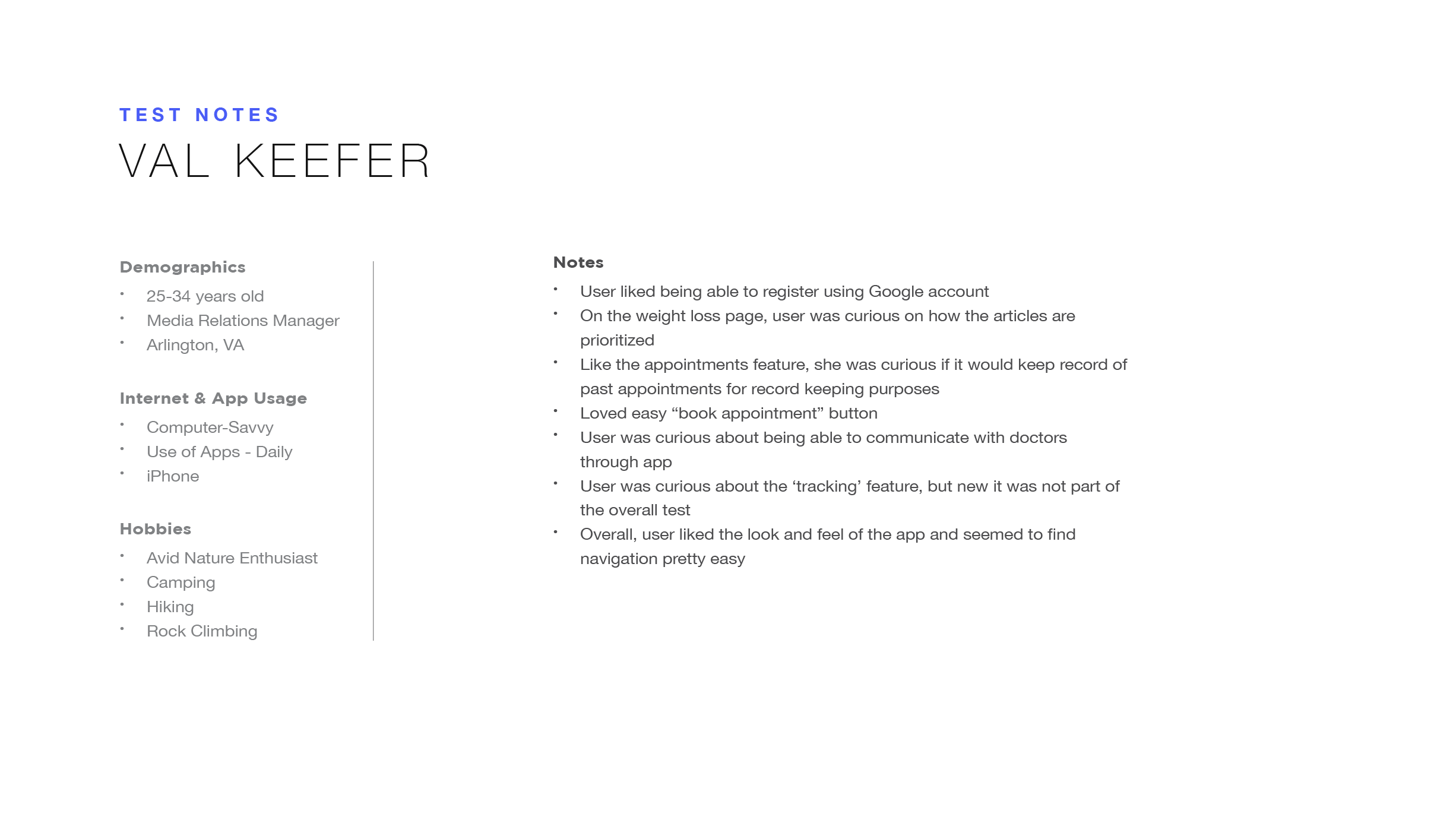
Participants: Recruited a total of 6 participants (colleagues and friends) to take part in the usability test in order to receive a satisfactory amount of insight and feedback. Participant ages ranged from 26-54. All participants were professionals and had prior experience with health-related apps.


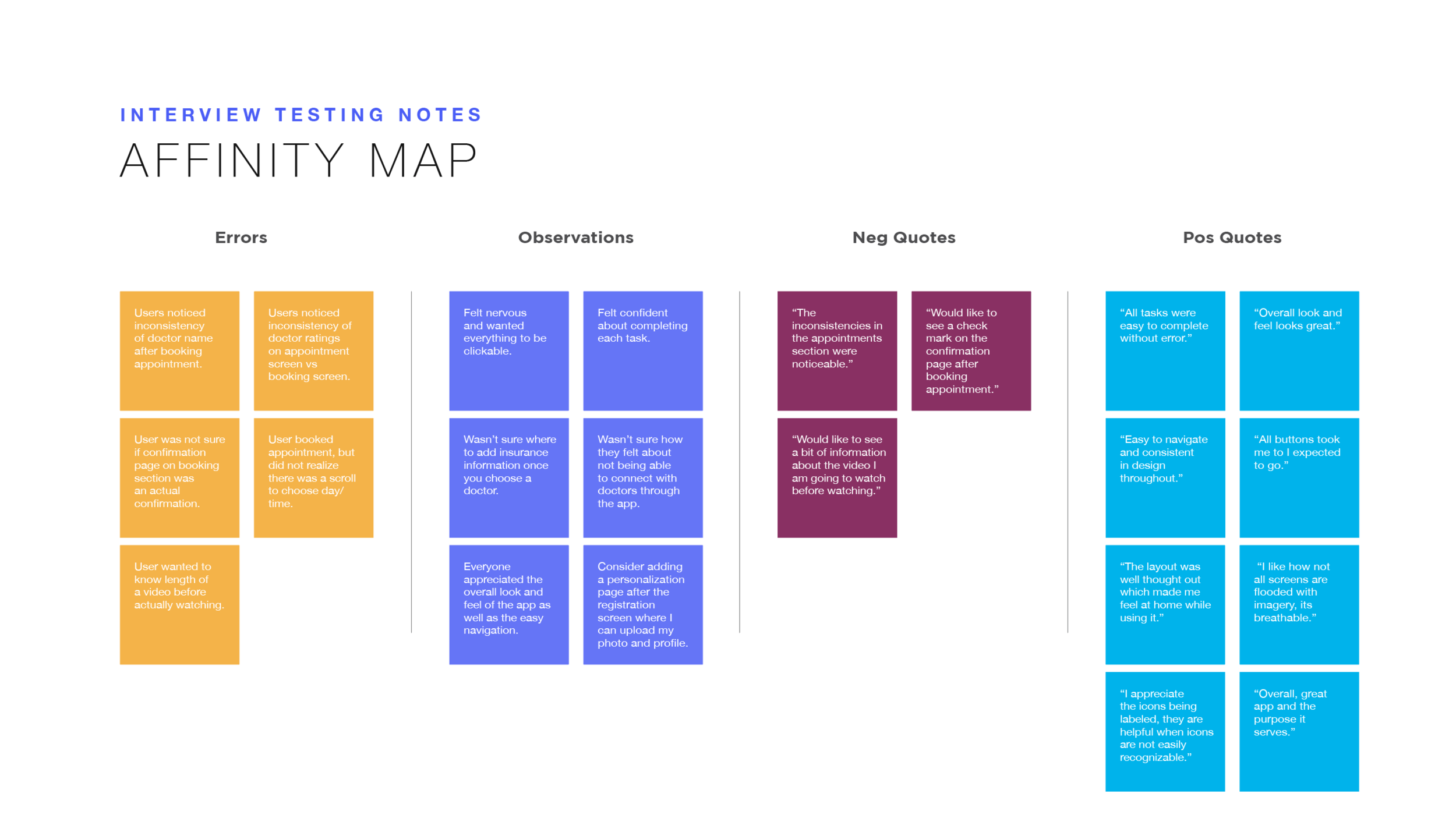
Affinity Map & Key Findings
Extracted insights from user testing. Olive received a lot of positive feedback. Users found the testing to be successful and seamless to complete. Many users pointed out benefiting from an app like Olive. The errors and observations noted below provided me with valuable insights that I used to further improve and enhance the app.
Usability Test Insights:
Participants found more cosmetic errors than usability errors
Emotional and behavioral observations were as expected
Satisfaction with difficulty and amount of time to complete was low
Participants found the app to be seamless in navigation

Style Guide
Creating the Style Guide and Design Language System was a great way to ensure consistency throughout the app.

final prototype
Olive: Health & Wellbeing
After a few rounds of iterations and usability testing, I worked on refining the visual design and function of the app: onboarding, home screen, discover screen, appointment screen and the achieve screen.
Credit: Illustrations. Slab Design @ Shutterstock
Reflection
What I’ve Learned
UX design takes a lot of time and patience. I have learned that going through the entire design thinking process is key and plays an integral role on how to approach problems and find solutions.
Research is the foundational element of any UX process and while it take a great deal of time to conduct, it becomes useful as you progress through the process.
Finding a diverse background of users to interview is important. Not always easy, but its best to find a pool of diverse individuals that can provide great feedback and insight on the project.
What Would I Do Differently
Dedicate more time to finding the right individuals when conducting interviews for user testing.
Dedicate more time to learning new tools and their robust features to better improve the prototyping phase.